CASE STUDY
Vision accessibility at the zoo
This project was a concept from a research methods course and presented to executives at Zoo Atlanta.
Challenge
The emphasis on the visual experience of an animal exhibit pose significant access barriers at the zoo for visitors with vision loss. The Zoo was interested in better support vision accessibility.
Solution
ZooServations, a web application that guides a user through a number of envisioned disability services to reassure visitors that their unique needs will be accommodated and prioritized.
My role and approach
- 01 User research
- 02 Exploring divergent ideas
- 03 Design and UI
- 04 Testing and evaluation
01 User Research
Are Blind people even interested in going to zoos? To find out, I crafted an online survey to understand the relationship that Blind people have with zoos.
Survey Results
Q: Why haven't you visited a zoo recently?
Top Answer
Wouldn’t be able to adequately see the animals
Q: What is your primary objective in visiting a zoo?
Top Answer
To experience the animals firsthand
The top detractor for visiting was not being able to see the animals. This reveals that there is a perception that the zoo is a space exclusively for sighted people.
Similarly, another major reason reveals there is a similar assumption that the zoo would not accommodate their disability. This was supported by salient comments respondents left:
Field Research
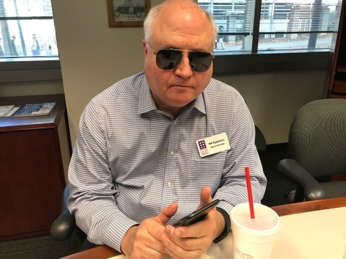
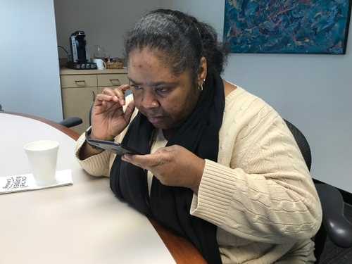
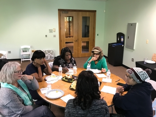
We conducted two tours with individual participants and one tour with a group of five participants. At the end of each tour, we conducted a closing interview and focus group respectively.
Various shots of contextual research we conducted: (from top) participant interacting with an audio-visual display; focus group after touring the exhibit; a participant resting on a bench.
We formally synthesized the data gathered from these engagements as a team through a process known as Affinity Mapping. The significant findings are summarized below.
Research results
I am sensitive to my physical environment.
Participants were acutely responsive to their discomforts, including temperature and physical changes in their surroundings (e.g. levelness of the pavement).
I want the agency in choosing my preferred method of interaction.
We found that participants valued touch and hearing to learn about the animals, but they wanted to choose which method given the circumstance or personal preference.
I require more information to make sense of an interaction.
The same amount of information or feedback that is provided to a typically-sighted visitor would not suffice for the Blind, who often require more description or other additional information.
With the goals of experiencing the animals firsthand and accommodating to heightened sensitivities and discomfort, participants needs were divided between lower and higher order desires. We formulated the following HMW:
How might we enable the lower-order needs of Blind guests at the zoo while also fulfilling their higher-order needs?
02 Exploring divergent ideas
Out of the approximately 100 ideas that generated from the newly-defined problem statement, we selected the most promising ideas to develop into lo-fi prototypes/ wireframes.

IDEA #1
Zooservations
A web app designed to allow a Blind visitor to request services in advance of their visit.

IDEA #2
Wayfinding Ecosystem
A necklace sensor that interfaces with an accessibility path with navigation and informational functionalities.

IDEA #3
Sensory Exhibit
A space with informational tactile and auditory display elements for Blind people and others with sensory challenges.
These shots follow the prototyping process for Idea #3, the sensory exhibit: After first sketching the idea, we constructed it using low-fidelity making techniques (laser cutting, glue, etc.); finally, we presented it to our stakeholders for feedback and impressions.
User feedback on concepts
We presented each idea to potential users and disability experts using an evaluative questionnaire with quantitative and qualitative responses.
Idea #1 - Winner!
Zooservations
Both experts and users believed it would make Blind visitors feel “special” and “wanted” at the zoo. The services presented in the app — which range from guided tours and parking lot assistance — gave the participants a high sense of confidence in their ability to maneuver and interact with zoo elements.
Idea #2
Wayfinding ecosystem
While the way-finding system scored well for granting users autonomy, it posed as yet another temporary device that users would have to learn to operate.
Idea #3
Sensory exhibit
The interactive exhibit was perceived as being geared towards children or visitors with total blindness.
ZooServations was not without its criticisms, however. Participants warned of the complexity that the ZooServations wireframes presented. Even read aloud to them, participants hoped the interface might be greatly simplified or that accessibility would be considered
03 Design and UI
For the scope of our project, we decided to focus on one product for our user: a service reservation portal. This meant we would not focus on designing the accessibility services themselves.
Envisioned services our tool would support
Informational Services
Wayfinding Services
Assistance Services
- Human-guided tour
- Self-guided tour
- Audio guide rental
- Biofact rental
- Braille guidebook
- Geolocation beacons
- Tactile pavement
- More prominent curbs
- Parking lot assistance
- Shuttle mobility services
- Restroom assistance
- Wheelchair assistance
- Reserved parking for Blind
Three user touchpoints
In line with our research, we designed for three different touchpoints based on our target population’s need for various interactions options. I focus on the web app for the remainder of this case study.
- Automated & human-operated phone system
- Mobile/desktop web app
- Conversational AI / chatbot
User interface design
Using wireframes and user flow developed by my teammate, I created the user interface design and an iteration of the high-fidelity prototype used for user testing.
Style sheet used for the interface design.
Some UI design decisions include:
- Large affordances in buttons and form options
- High contrast in type
- Large font sizes
- Minimal use of images

Screens arranged according to the user flow for making a reservation.
04 Testing and evaluation
We recruited two Blind participants to assess the extent of our systems’ functionality. I led one usability test, using a “Wizard of Oz” style approach to mimic a screen reader.
Link to our prototype


We observed users using our prototype and took note of their usage and questions.
Evaluation results
✅ What worked
❌ What could be improved
- Users were familiar with basic mobile functionality. For them, this was the easiest and best interface.
- Users liked the layout without visual clutter, simple question format, found it “user friendly,” and liked the ability to “pause” when making reservations.
- Users liked the ability to choose multiple options on the food and accessibility selection screens.
- Lack of voiceover and screen reader functionality. (Axure did not support this)
- Users requested additional accessibility features (ability to change background, contrast, font size/color, larger buttons, etc).
- Users wanted a review page at the end that summarized all the selections, with the option to edit their choices.
Users affirmed that the concept brings comfort that their needs are acknowledged and accounted for, as illustrated through this quote:
Reflections
Although this project was an excellent opportunity to practice service design, we chose to focus on a supportive frontend system due to time limitations (it was a semester project). This just made me reflect on the complexity of what the holistic project might call for and how to balance the right scale of a design intervention.
Moreover, this project exposed me to the many facets of accessibility design in visiting our participants’ homes, rehabilitation centers, and seeing firsthand the extent to which the built environment may not accommodate Blind people.
I hope to carry these insights for accessibility into future work regardless of the specific target population.


